

I was not satisfied with the painting I did on this home, and based on the feedback from my art friend Sea, I made some changes. Here's the original below:
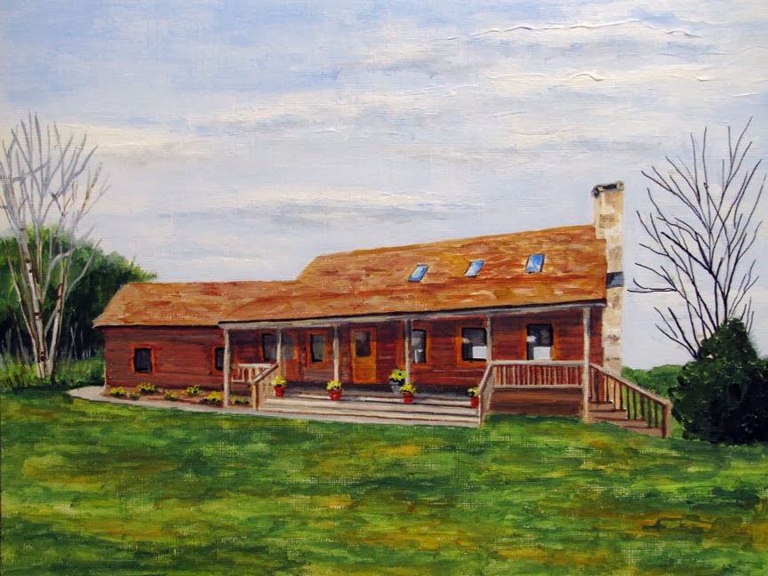
I darkened the upper blue of the sky & redid the tops of the clouds to give the sky more character & depth. I darkened the forefront green grass. These 2 items made the focus be on the home. Then, to add a bit of visual interest, I put a few autumn leaves in the foreground as well as a few strays on the trees.
I like this new version much better. Before, it was too stark and too blah looking. The revise keeps the grass colorings, only shades the forefront. And the blue of the sky is much better with the pronounced darker blue at the top. And adding those few leaves add interest. Ok, I'm happy with this again! Thank you Sea.
3 comments:
Thank you. I like it much more too. I love the darker sky and the leaves seem to make it friendly. I'm sure the patron will be happy.
I do love the darker sky and anything with autumn leaves gets my vote!
I like the leaves on the trees. Great work.
Post a Comment