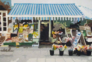
Time for something a bit abstact. I loved this market scene, but also thought it was very busy. Whenever I find a scene is very busy, I usually paint it as an abstract. It always seems to simplify and calm things down a bit.
I find that taking these photos into photoshop, then using one of the abstract filters - I can adjust the number of colors, the definition of the edges, etc. - until I like the image. Print it out, sketch it & then paint the shapes.
Never ceases to amaze me that you can paint shapes, and colors -- then step back and you see the entire scene!
Acrylic on 9x12 canvas

6 comments:
Belle scène de vie que celle-ci... En ce moment je suis en train de peindre une scène de marché aux fleurs dont vous pouvez retrouver le croquis sur mon blog.
Votre peinture est resplendissante de fraîcheur.
Amitiés
Your last line reminds me a bit of the theories behind pointillism. I like this scene too...I am reminded of wholesome things, Sesame Street and the store in the show...Lovely!
This is wonderful Nancie. I'm going to have to try your photoshop technique. What a great idea.
Thank you all for your kind words!
Martine, i don't speak french but I translate your comments and I thank you for them. I went over to your blog and I see the market painting you are beginning - I am looking forward to seeing it completed!
Sherry - interesting that you mention pointillism. That is something that intrigues me, but I do not know if I have the patience for it. But I do love the concept (and it is one that VanGogh used, as well as other artists) - putting two colors next to each other and letting the user "blend" them. I had a challenge once to reproduce one of VanGogh's works, and I was amazed as I studied it, just how many strokes of different colors he added. Colors you would never associate with a tree or hair color. It totally amazed me.
Nancy - I wish I could take credit for this idea, but I believe I stole it from another artist. :) I have been making Photoshop more-and-more an artist tool for me. I always used it to combine things, but to alter the "look" was something else. Both of my abstracts on this blog were "photoshop" designed first then painted. Interesting thought, the other abstract (Cafe Scene) I did not like how photoshop altered the entire image. So I actually "altered" the image 3 different ways, then plucked out only the parts I liked from each one. Made it even more interesting!
Nancie i saw this on the Artist Network Forums and decided to visit your blog. I love your blog and i am glad i visited, your blog is fresh and interesting, love the direction of your work also.
Thank you so much Priti, for you kind comments & for visiting my blog. it is very much appreciated!
Post a Comment